HOKU! · Olive oil · D2C
An olive oil brand that refuses to look like every other bottle
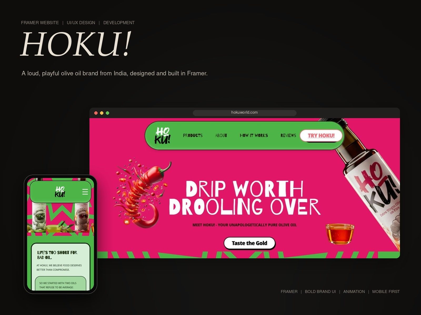
A bold, playful Framer website that matches HOKU!'s loud voice and stands out from the first scroll.
The challenge
Olive oil brands in India all look the same: green bottles, quiet labels, health claims. HOKU! is loud and playful on purpose, and it needed a website that felt as bold as the brand.
What we did
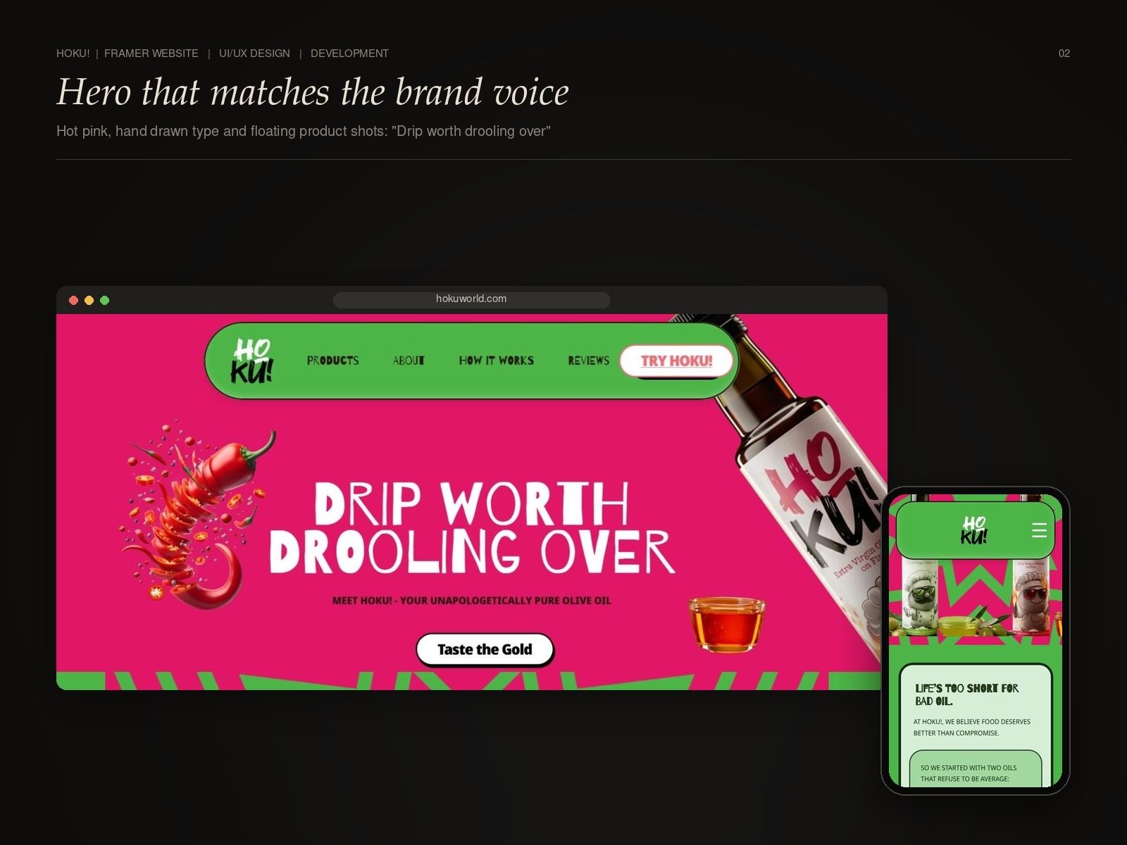
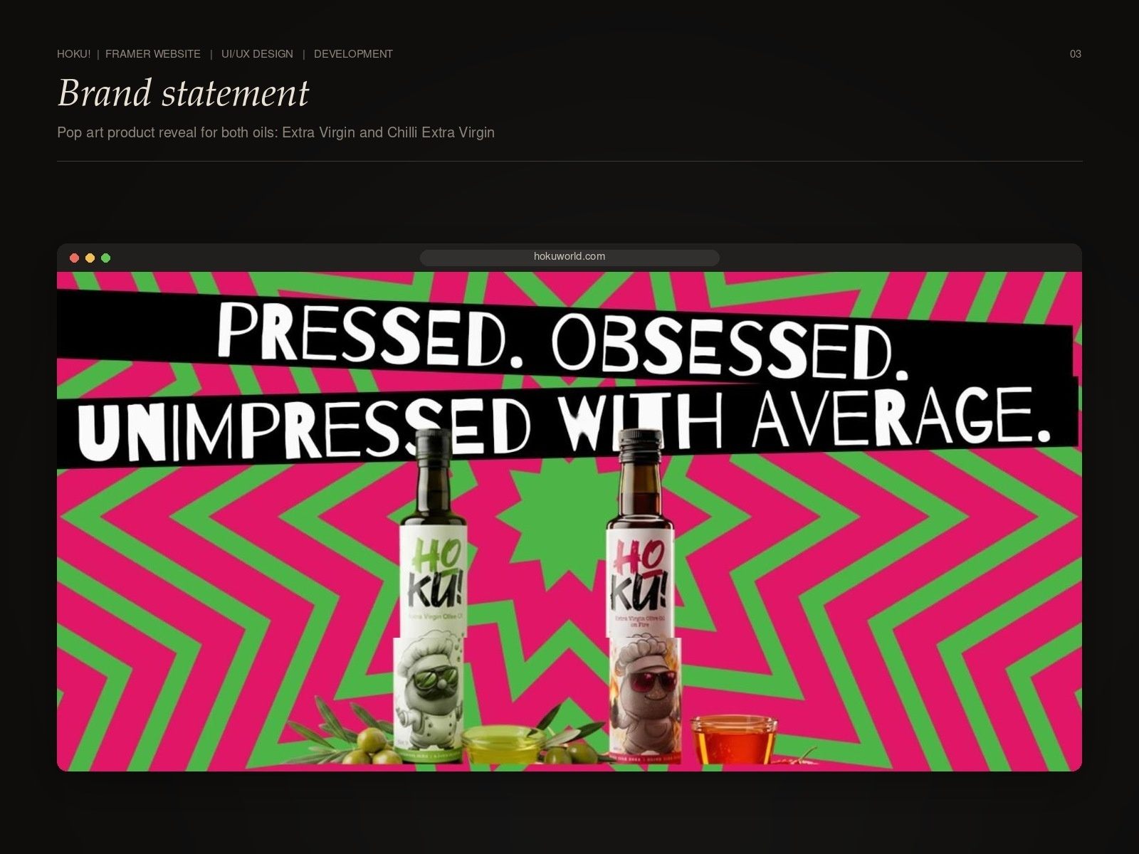
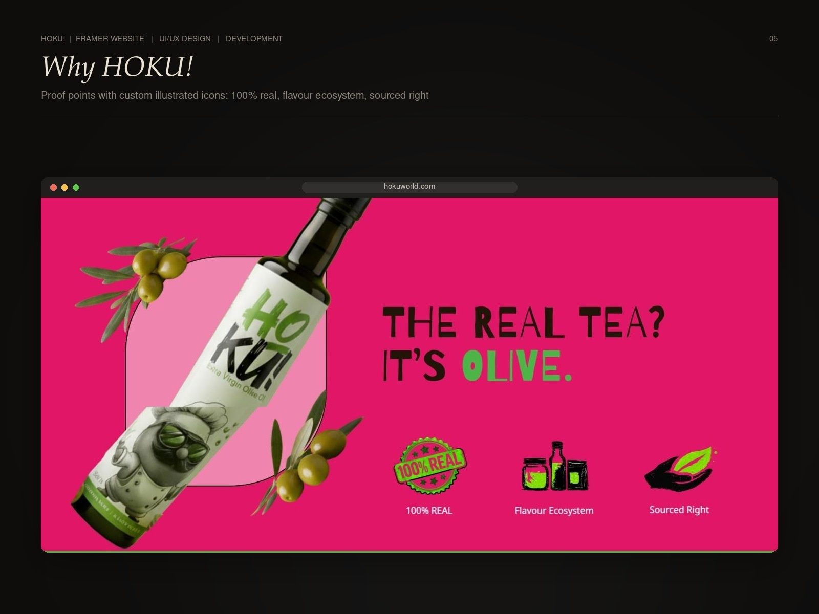
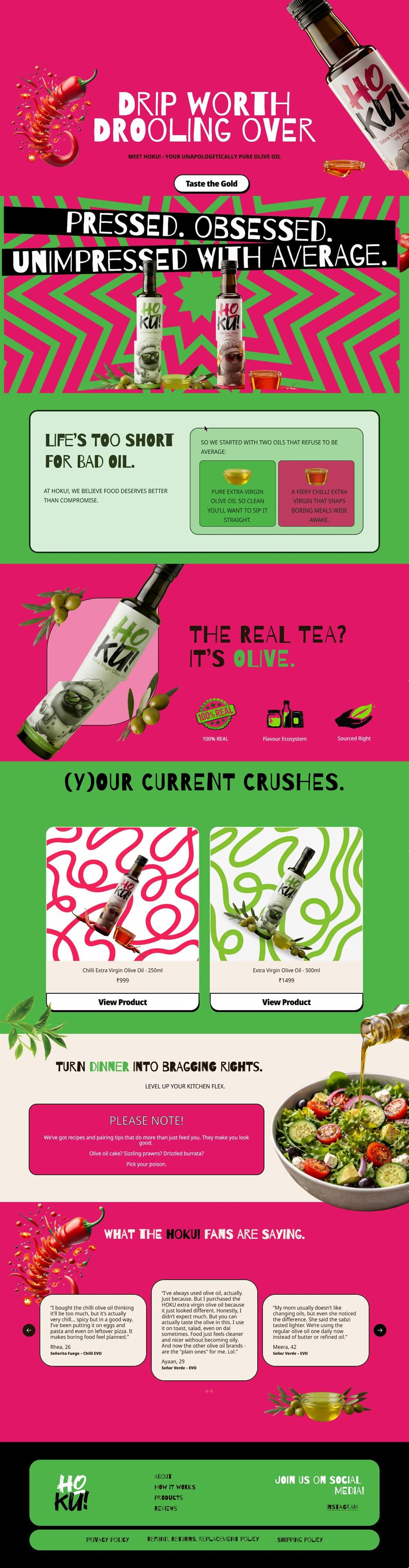
- A site with a personality, not a template: hot pink and green, hand-drawn type and pop art backgrounds
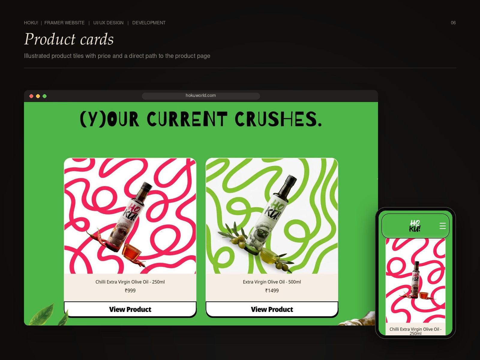
- Animated, floating product shots
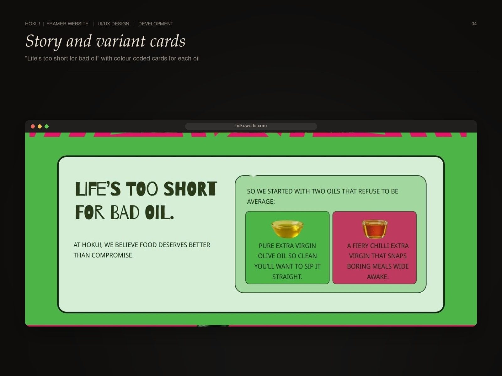
- Colour-coded variant cards that make the two oils easy to tell apart
- Illustrated proof points that explain why HOKU! without walls of text
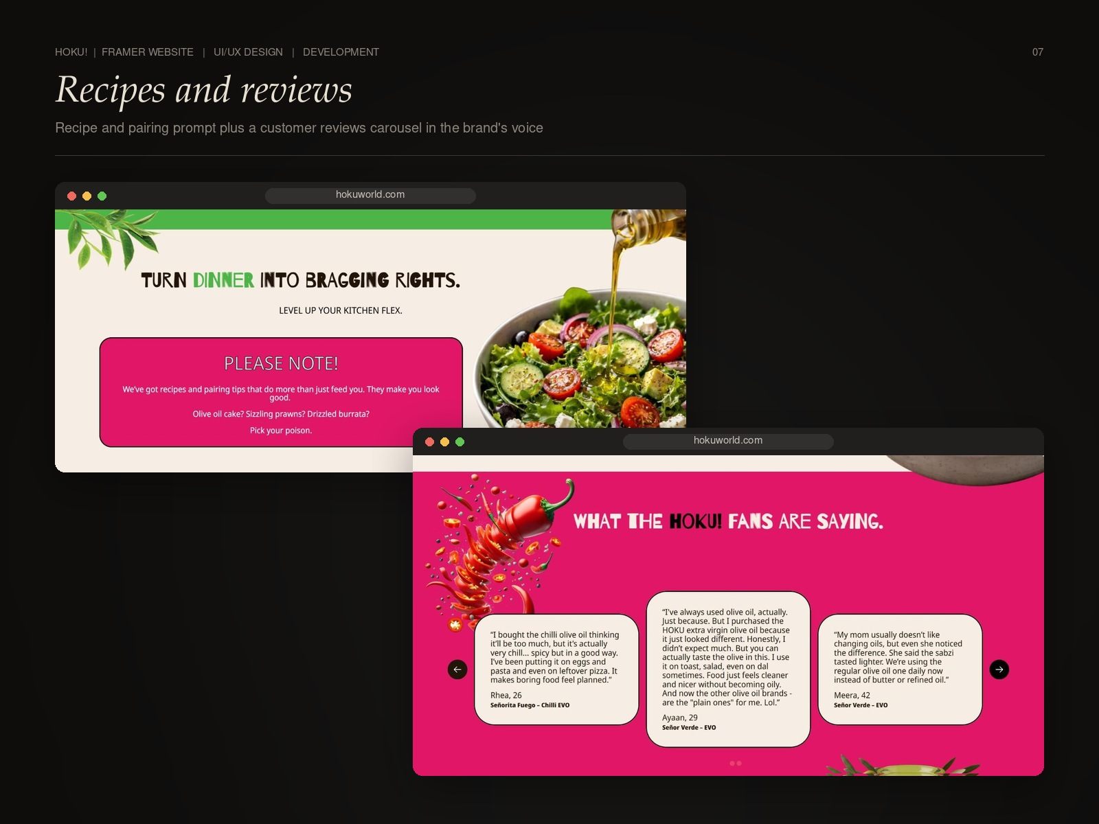
- Recipes, pairing tips and a customer reviews carousel
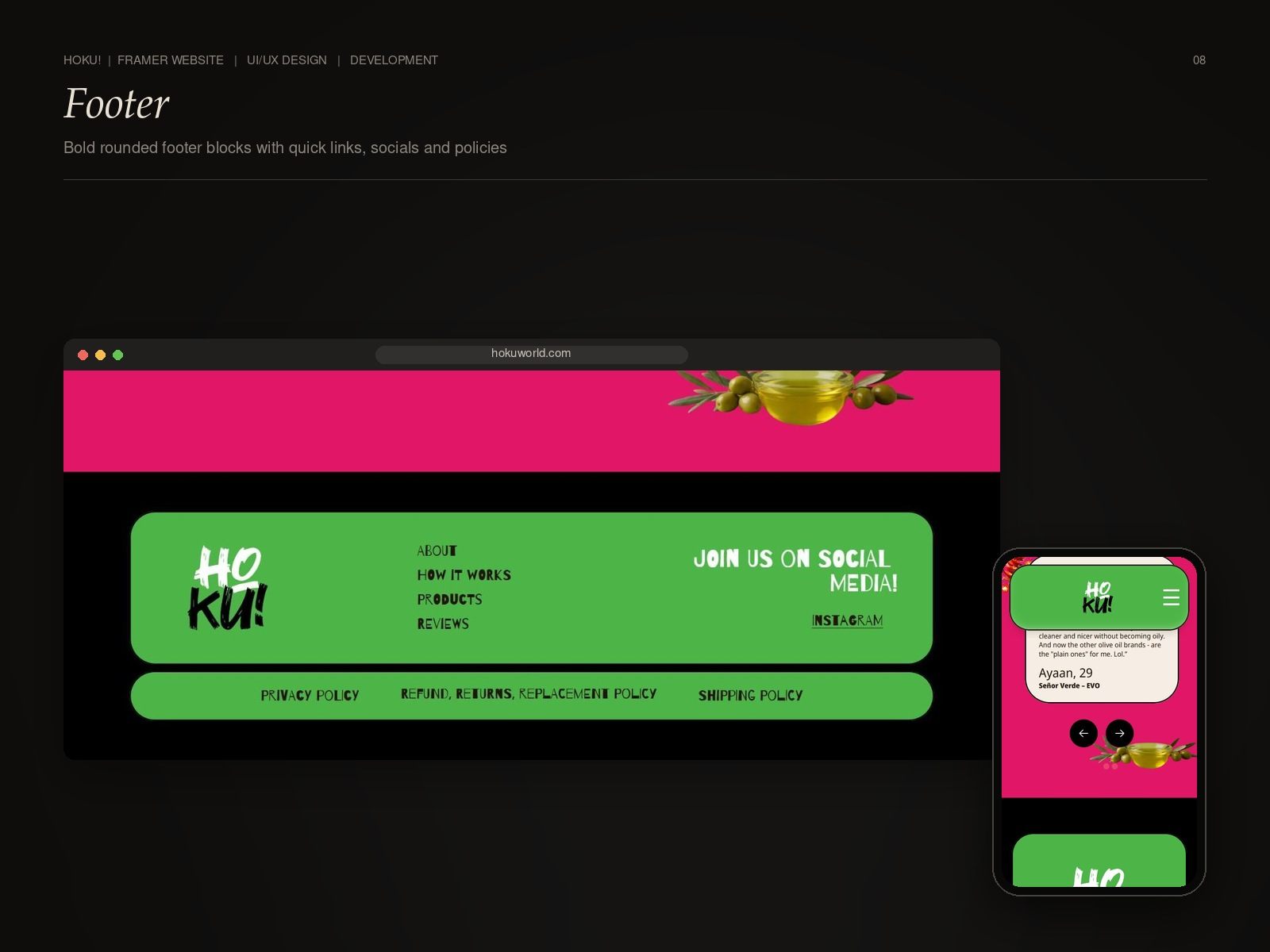
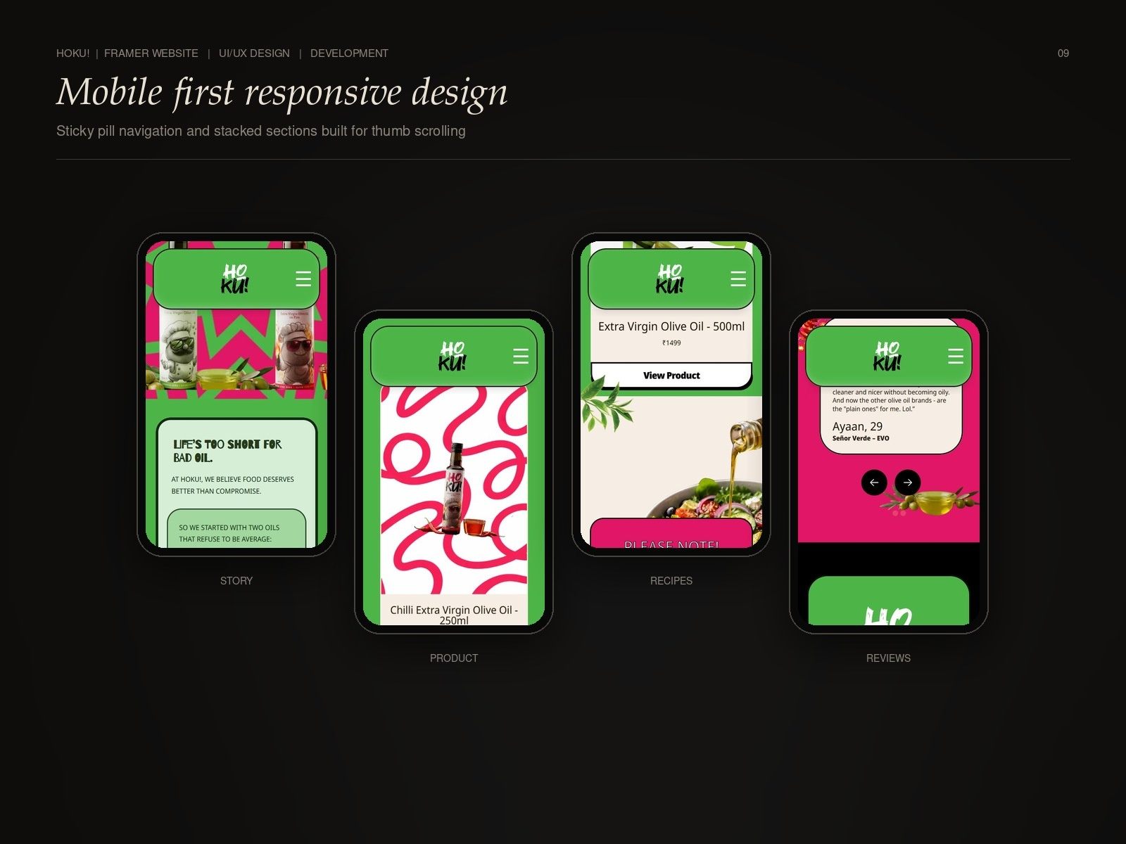
- Sticky pill navigation and a mobile-first responsive layout
The result
A website people remember, in a category where most brands blend in.
Inside the project
A Closer Look
Next step
Want This for Your Business?
Tell us where you are stuck. On a free strategy call we will show you what we would do first, and what it could do for your numbers.